

I think you answered your own question. If they're making that big a deal out of it ... it's the new brand.Originally Posted by SmoothPancakes


I think you answered your own question. If they're making that big a deal out of it ... it's the new brand.
Twitter: @3YardsandACloud


I'm pretty sure the Army-Navy game will remain the same. That game has a brand too.
Does this make it better? It's not exactly new to West Point.

Twitter: @3YardsandACloud
Eh. I'd be more impressed if it were a beret.


Navy's new Under Armor uniforms:
New @UnderArmour @NavyAthletics football uniforms on display at Navy Stadium. Cc: @PhilHecken @UniWatch pic.twitter.com/3hFX924XlM
— Pam Chvotkin, Storyteller (@reddusfoximus) April 18, 2015


I really hope those two middle ones, #96 and #80, just aren't having their colors come through very well in that picture. They almost look like black and come across looking very Army like, which would be a HUGE screw up for Under Armor.
#TheScriptIsDead
Okay, definitely the quality of the picture. Those were actually all of last year's uniforms.
#TheScriptIsDead@reddusfoximus @UnderArmour @PhilHecken @UniWatch those were last year's uniforms Ohio State, home and away and Army uniforms.
— Navy Athletics (@NavyAthletics) April 18, 2015

http://www.cbssports.com/collegefoot...forms-for-2015
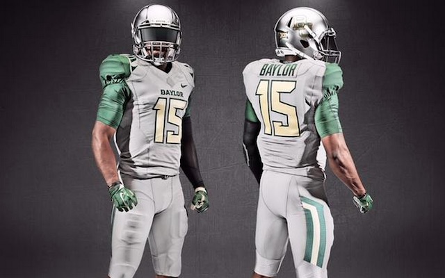
Baylor has new gray uniforms for 2015

Those are slick.
The dude abides.
I forgot about this thread. Is it uniform season yet?

meh,ok,not good,not bad
As rumored, Michigan going from adidas to Nike.
We're Back #JustDidIt #GoBlue - http://t.co/cWfbD9cKgK pic.twitter.com/L0K2u7d025
— Michigan Football (@UMichFootball) July 6, 2015
IIRC, Michigan was the flagship adidas school (even though Nebraska was first to switch to them in mid-90s, but I digress) and was earning $8.2M a year from them. Nike must have backed up a Brinks truck to the door.
Through 2014, it appears the top Nike school was Florida State with $4.4M a year. I'd have to guess this new deal doubles that.
Last edited by cdj; 07-06-2015 at 04:19 PM.
Numbers will be announced next week.
Deal is through 2027 (?!?) with a Michigan option to extend to 2031 (?!?!?!?!?!).
Mgoblog currently believes that Nike deal is actually worth less than the Adidas deal, but the department went forward to Nike due to player and department preferences for Nike versus Adidas.
Twitter: @3YardsandACloud

I was thinking this may be the best time to enter a long term deal with Michigan. The football program has been down for several years now and that won't last forever.

Michigan has always been a Nike school at heart. When they switched to Adidas that's when things went south. Now I can actually buy some Michigan gear, won't wear Adidas.
Also some rumors that Wisconsin may be eyeing move to Under Armor.

More butt ugly uniforms...
Paul at Uni Watch just slams the nail on the head.
Beastly Bruins
By Paul Lukas, on July 10th, 2015
I can no longer bring myself to get worked up about lousy college football uniforms. The whole enterprise now has little to do with uniform design and is more akin to toy design, with the fairly obvious goal of allowing teen-age athletes (and, by proxy, the portion of their fan base that uses “sick” as a compliment) to indulge in some sort of juvenile comic book superhero fantasy. I don’t even roll my eyes at this stuff anymore — I just put it in the Ticker and move on.
But I’m going to make an exception today for UCLA.
UCLA should always be one the best-looking teams in college football. They have an unbeatable color combo, a unique number font, and a shoulder stripe pattern so iconic that it’s named for the school. How could you screw that up?
Like this:

Last edited by bdoughty; 07-10-2015 at 05:45 PM.
I like 'em

Love their shoes but any uni that Adidas touches... they destroy! I'm becoming a big fan of UnderArmour though.
The new Nike uniforms for Tennessee.
http://www.saturdaydownsouth.com/ten...nike-uniforms/
Away uniforms
http://www.saturdaydownsouth.com/ten...home-uniforms/
Home uniforms
http://www.saturdaydownsouth.com/ten...nate-uniforms/
Alternate uniform
 Posting Permissions
 I understand that. Just they seem to be making Army West Point a major point in the changes. Even their Twitter account is now Army West Point Sports, Army West Point Football, etc. I'm just wondering if they are planning to use Army West Point as their name in sports or if they'll just stick with Army.
 Reply With Quote
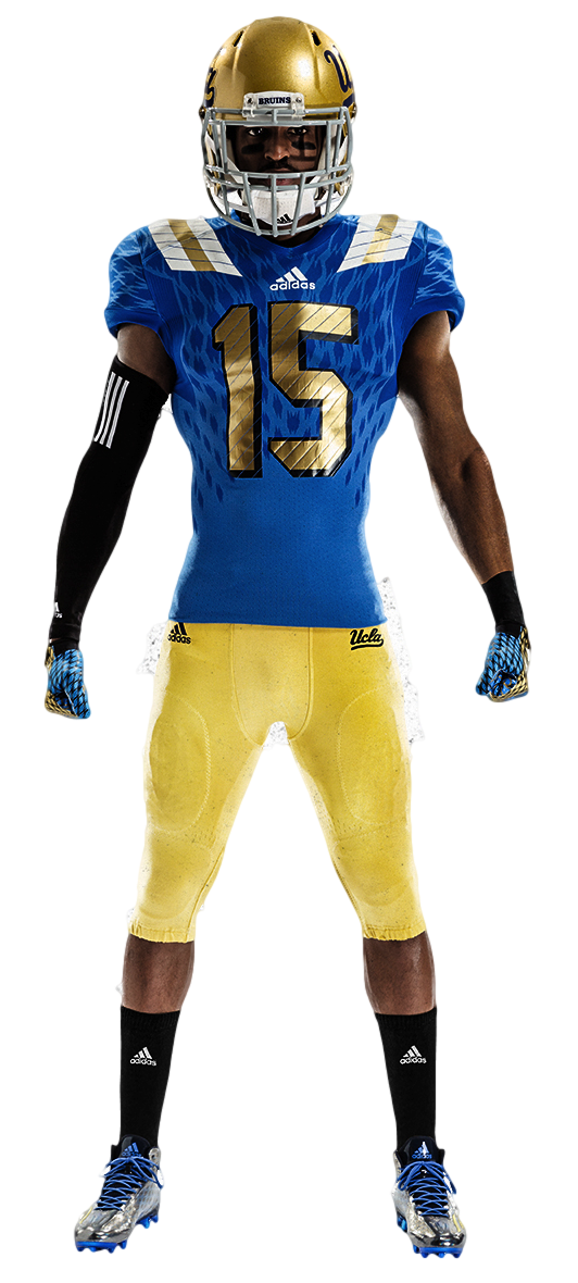
Bookmarks