


Just a logo test=-=-=


Nice!

I call FB #44!
Last edited by razorback44; 07-06-2010 at 11:23 AM.

Count me in for MLB #56

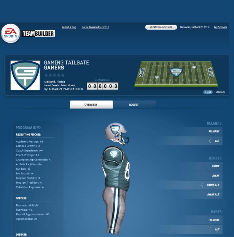
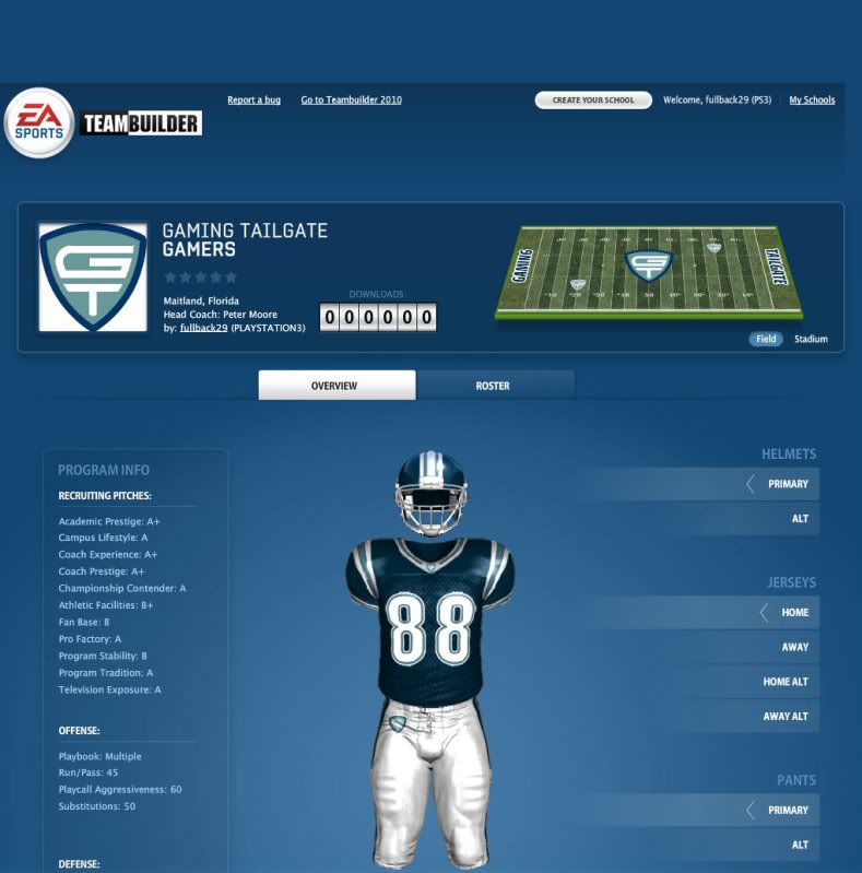
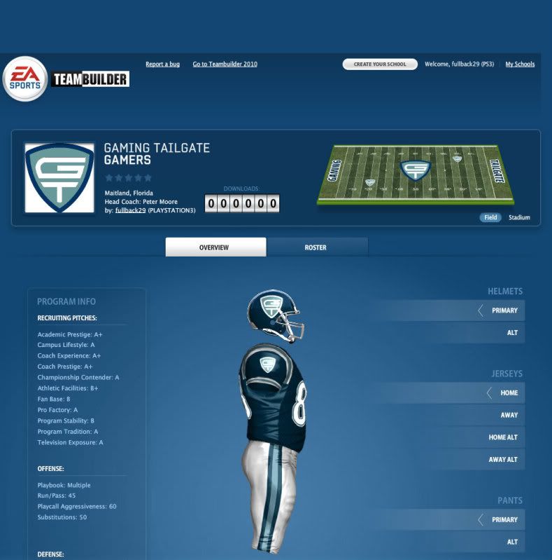
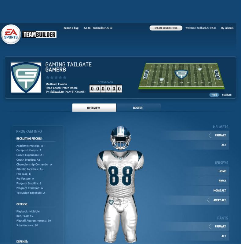
Mine:


Hahaha!
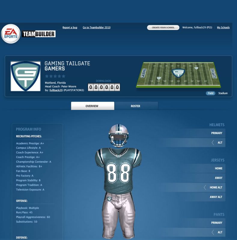
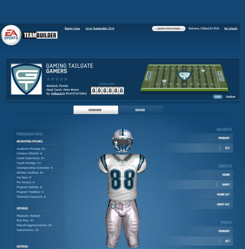
Love the grill on the pants and sleeve!!!
Originally Posted by steelerfan

Yeah, had to use it.
That's pretty nice too. You guys are good at this.
I guess I should also mention that my number is #14 (it was my basketball number back when I hooped)
Can't wait to download the team whenever it's finished.
Can I be a tight end and #80?
Those are pretty sweet mors!
may I try ? are there a couple more people on here who want to attempt?

I'll take #11 if it's available, or if the none of the QB's will take it. My second choice would be #81.

SS #16
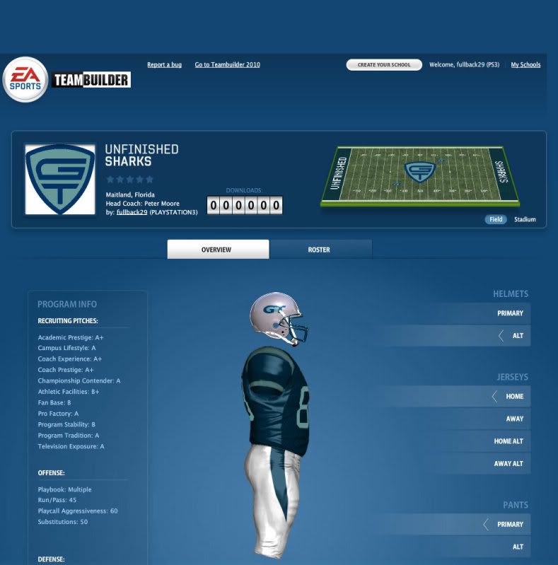
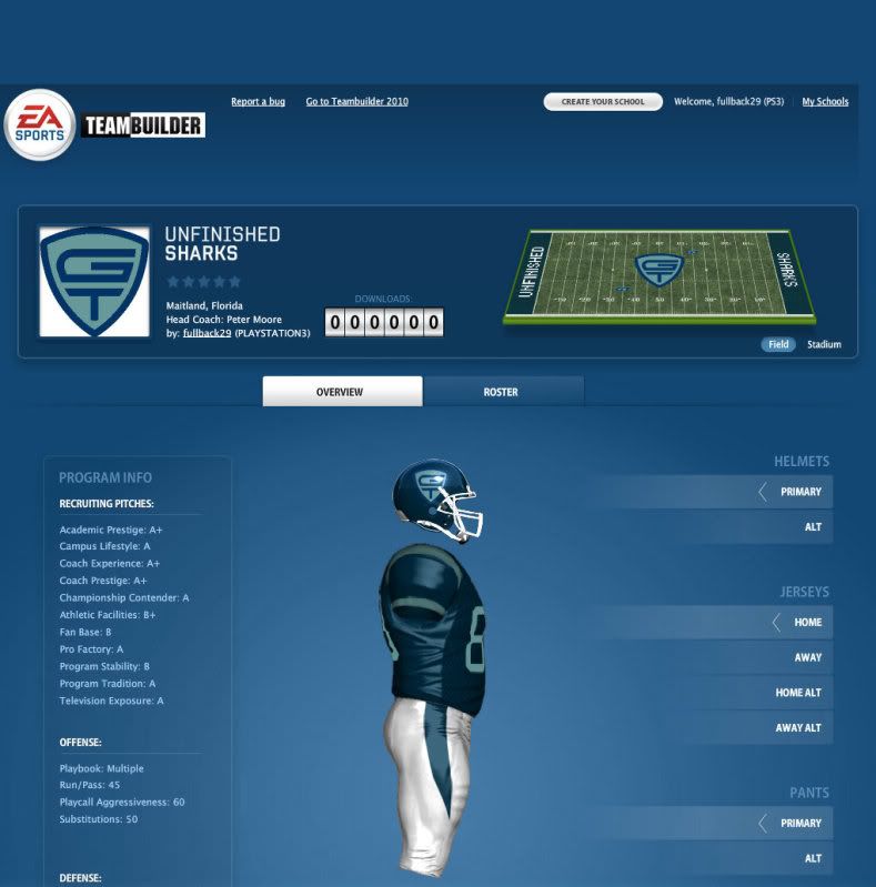
I stayed somewhat traditional
You are certainly welcome to come up with some as well. I was just posting what I thought would look good (and to show off my two logos).
Only issues I have are:
1. with your logo like it is, it's a little too close to the Superman logo for my liking
2. The coloring of everything is off - the dark blue is too dark and the light blue is too light
I like the usage of the grey though. I went with white instead and I'm thinking about adding in grey as well for some of them as I think the grey along with the two blues are nice complimentary colors.
Obviously, the pant and jersey styles are completely up for grabs as, truthfully, I don't really care for any of the combinations that you have available to you on the Teambuilder website (which is why, usually, I go with plain pants and very limited strips on my jerseys).
I definitely don't like the logo on the shirt collar like that. I made that mistake with my old Saint Augustus jerseys and I hated them.
 Posting Permissions


 Reply With Quote

Bookmarks