
The size is something I can't help because of the limitations on TeamBuilder. I like it better than a vertical bolt after trying a few out. It's been used, but it's a different color scheme altogether.Originally Posted by HuskerBlitz


The size is something I can't help because of the limitations on TeamBuilder. I like it better than a vertical bolt after trying a few out. It's been used, but it's a different color scheme altogether.

I like the new unis, makes them look less like USC. Of course, I've always been partial to white helmets. That, and they look suspiciously like another Nebraska school...

Still hideous
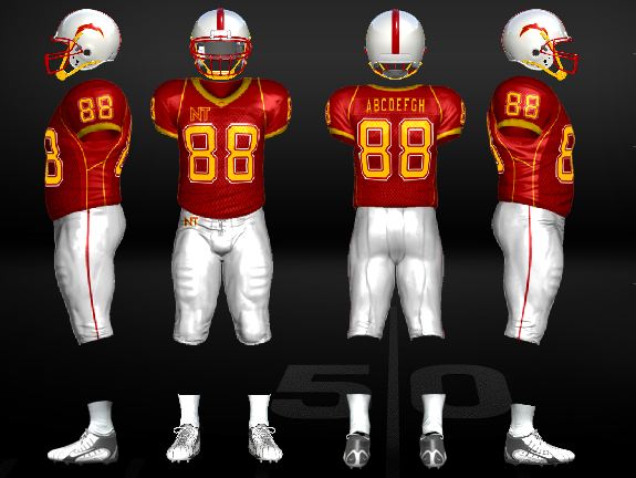
Honestly JB, part of it is that the inside of the numbers (and NT logo) is the same color. Though the white pants certainly help.
Twitter: @3YardsandACloud

I think that the closeness is what throws this off. I would not have the NT on the jersey above the numbers. I think that the NT on the pants and the lightning bolt on the collar is plenty. But the jersey is overkill. Other than that, I think it looks kinda sharp now with the white helmets and pants
Thanks for the feedback! I like the NT, maybe I'll try moving it to the shoulder.
Since I'm running the Pistol, I will match Nevada's roster.
Just downloaded my team, got into a game, and the lightning bolt is much bigger in game...it looks NICE, will do a video of an exhibition of Nebraska and Nebraska Tech and have it ready to post when the embargo lifts on Friday.
One more jersey update...the red numbers were hard to read in-game...made them gold
Okay one more update LOL making name and numbers white.....
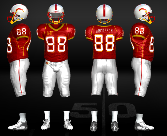

Those are much better, IMO, JB.
OMG JB, THAT'S BALLIN'. The shoulder I thought about, but forgot if that was an option. Oh man those are sharp! Good work. btw, what do your away jerseys look like?
Last edited by Jayrah; 07-03-2010 at 02:44 PM.
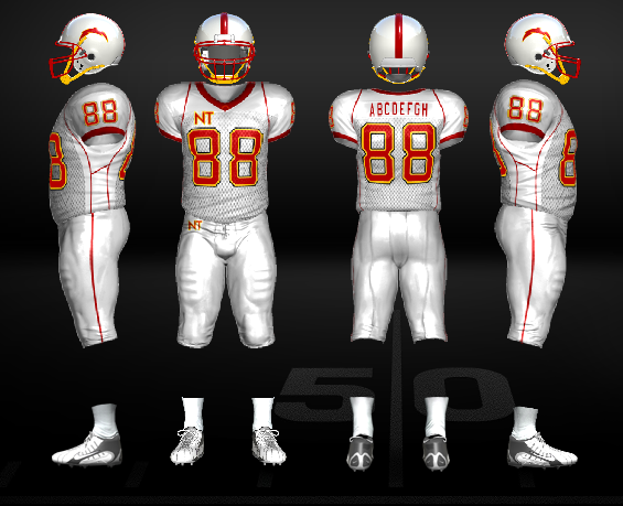
Thanks guys! Here's the away jerseys.
And away with alternate pants.
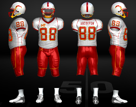

Those look great man. Not much for the yellow chin strap on the helmets, but it looks really great.
I like. The red with the yellow pants just hurt my eyes!


Looks like Iowa State has invaded Nebraska.
I know ... kinda thought that too LOL but at least I'm in the Big Ten with this team
I will get this dynasty going sometime around release as I'm going to do it online I think with Dynasty Wire. Not sure how many more times they will flush out online as they get ready for release, so that is why I will wait.

Like the new white numbers on the jersey. Makes it pop a lot more now.
 Posting Permissions

 Reply With Quote
Bookmarks