
i take this back. the base defense will be a 5-2. it'd be nice to see some updates to this defensive formation.Originally Posted by baseballplyrmvp


i take this back. the base defense will be a 5-2. it'd be nice to see some updates to this defensive formation.


Interesting...a 5-2? Does any other college team have a 5-2 base D? That seems counter intuitive to stopping most college offenses...excluding Stanford.
it's a very high risk/high reward defense....but after the monte kiffin nightmare, anything will be an upgrade. this 5-2 will give a lot of flexibility as we can run several packages out of it.
so apparently, its not a traditional 5-2..... its uses the 5-2 personnel, but the 2 DE's being stand up rushers...giving it the appearance of a 3-4. should be interesting to see.

That makes a hell of a lot more sense. A base 52 would be easy to beat. Or, more likely, you'd almost never be in base.
Ohio State week be effectively basing out of Nickel Over this year, though some are calling it 425. The personnel will match in-game Nickel Strong.
Twitter: @3YardsandACloud


New logo for UConn:
New logo for Cal:


I like the UConn one but the Cal one is HORRIBLE! Eww.
Edit: Now that I actually seen a blown up picture and not a thumbnail, it's no longer horrible. Now I just don't like it.
American Athletic Conference logo will be unveiled on Thursday.
EDIT - USA Today with an early look.
Last edited by cdj; 05-29-2013 at 11:16 PM.


Here's the new Sun Belt logo... it's designed to use different colors based on each team. You can click here to see examples of each
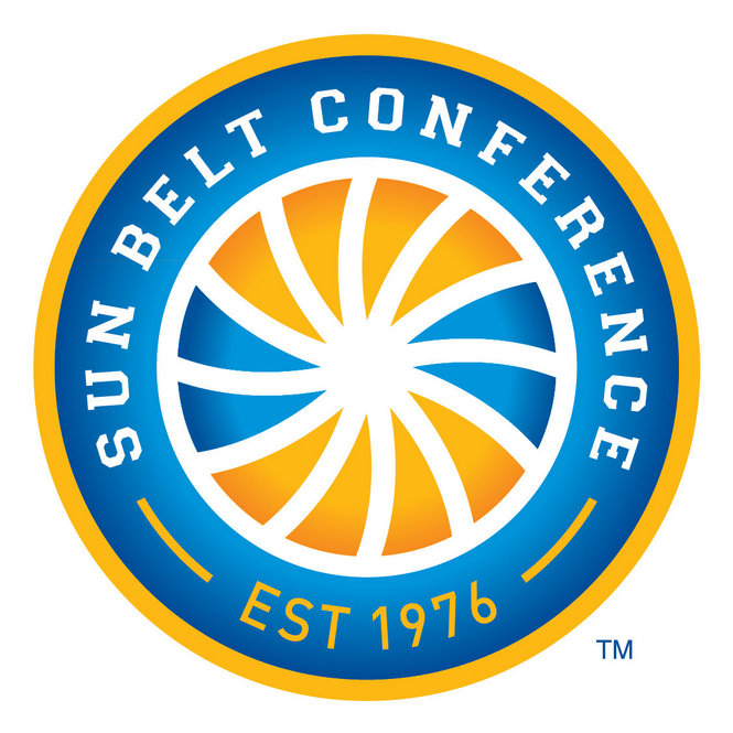

Some look too similar. They gotta all look different! ULM and TxSt look the same, ULL and WKU also NMSU kinda. No big deal but I think it'd be better for everyone to look different

lol not really seeing a change there
Maryland has kinda stopped using the Terp "M" logo for about two years now. They use this now

*ALL LOGOS HERE* http://www.trademarks.umd.edu/marks/ath.cfm
Last edited by OSUCowboyofMD; 06-17-2013 at 12:22 PM.
The Big Twelve will unveil a new logo this summer, with significant placement on fields, courts and around campuses
 will be switching to a 3-4 this season.

Bookmarks