

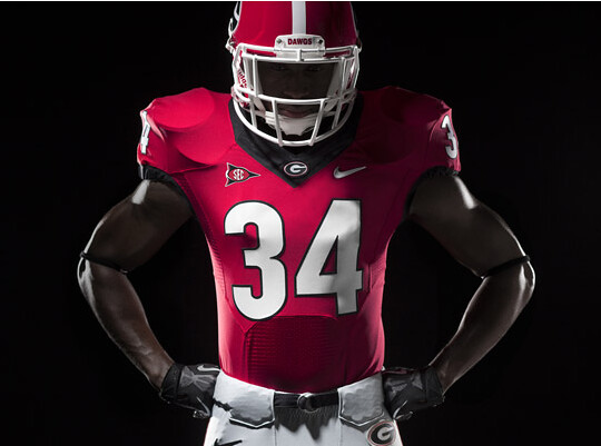
not easy to tell but Georgia is re-branding-number font is different, bulldog logo is differentOriginally Posted by souljahbill

http://www.uni-watch.com/


not easy to tell but Georgia is re-branding-number font is different, bulldog logo is different
http://www.uni-watch.com/

Count me in the group of people who don't like multiple colours on the facemask. Another Oregon team with funky uniform styles... just what college football needed more of...
Last edited by ram29jackson; 04-21-2013 at 08:14 PM.

Oh Ram. You so crazy... Image not available because the URL is from your inbox.
Last edited by bdoughty; 04-21-2013 at 06:21 AM.


The Ram pic NEVER gets old! NEVER!
The multiple colored facemasks don't bother me. I actually like Maryland's "Pride" unis. The ONLY outrageous think I haven't liked was the Notre Dame blue-on-one-side-gold-on-the-other helmet. I HATED that. It would've been SO clean if it were blue with a gold stripe or the leprechaun was gold. The way they did it was just ugly.

Enviado de meu SAMSUNG SGH I997 usando o Tapatalk 2
Threw up a little bit when I saw the new West Virginia jerseys...

I LOVE the new Beaver head logo that OSU will be rocking.
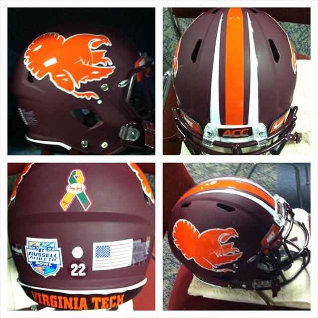
Love these helmets as well as the Turkey track white helmet.
Thank you Oklahoma for not falling into this trap of hideous new uniforms. I have no problem going old school on occasion but it is just become how can we top this.

I like these, kinda looks like the Valdosta Wildcats uniforms.


Oregon's Spring Game Uni
Seriously? Does Oregon REALLY need any more damn uniforms? Jesus Christ, they have more damn uniforms than entire conferences combined.
I wish Phil Knight had gone to Southern Miss.

It helps when one of the biggest uniform/athletic apparel manufacturers is in your back yard and an alumnus. Remember when he stated that if Oregon had asked he would have built them a blue practice turf to help prepare for the Legarrette Punch game against Boise State. If you ever get a chance visit the Nike store in Eugene. I went in high school, and I have never seen so many exclusive colorways of Jordans and other shoes, and this was about 10 years ago before the "hypebeast" movement.
 Posting Permissions


 Reply With Quote


Bookmarks